Notes for a more inclusive internet: Alt Text as poetry

Published on: 2 December 2022
In the context of creating feminist infrastructures, a call from the feminist collective Numun Fund sparked the creation of a workshop “Talking heads: creative translation of images for a feminist internet”, a space guided by feminist exploration that sought to make the internet more inclusive and focuses on the needs of people living with vision disabilities. In this article, we summarise the highlights of what we learned in the sessions.
The “Talking Heads” workshop is inspired by the “Alt-Text as Poetry” workbook created by disabled artists Bojana Coklyat and Shannon Finnegan where poetic impulses emerge to create image descriptions for an internet that includes more people. And when it comes to describing, it’s not just about brief remarks but also improving accessibility, perception, feelings and senses for low vision and blind people that use automated screen reading programs to navigate the internet.
Coklyat and Finnegan invite us to play with language while following a certain character length and the need to inform.
An example could be the description that accompanies an image of an average garden.
We could have two options for an Alt-text regarding the same space:
For this reason, we interviewed 3 blind and/or people with low vision that would become our counsellors and guides during the workshops. We were interested in learning about the problems they face on a daily basis in an internet that, until now, is not designed to include all types of people despite the fact that internet is increasingly imposed as a mandatory bridge to access basic rights for the entire population.
From our conversations and what we shared together, we reached some criteria to work on a diverse visual documentation of the participants, as well as images that we selected online from feminist media and from feminist and trans-feminist organisations.
Ten people from different parts of Latin America participated in this activity wanting to support and encourage online and offline spaces through art, graphic design, grassroots communication and community technology for more inclusion and accessibility.
It was our first time gathering online remotely, without cameras or PowerPoint presentations, just the images we used to experiment. To start off exploring, we agreed on a framework of certain relevant points with our guides (two people self-perceived as women and a LGTB guy) based on our concerns and needs.
Another thing we found out is the valuable piece of advice of including elements of other sensorial channels apart from the visual aspect when describing images. For example: describing someone “laying down on a bed of dry and crunchy leaves” is more efficient for a visually disabled audience than “on a bed of yellow and orange leaves”. Or describing: “a cloud that smells of pollution covers the sky” instead of “a grey cloud covers the sky”.
One of our guides pointed out that “smells, attitudes, colours can enhance descriptions”. An activity that we couldn’t do in the end because of time was to listen to how descriptions work through screen readers. We wanted to check out how those robotic European accent voices sounded like, not a comfortable way of helping us navigate the internet in our everyday lives.
Here are some main ideas that help us describe images more precisely:
Regarding the importance of image descriptions, one of our guide says: “I’m new to all this technology. I would get lost among the entertainment and information. Descriptions help my mind travel and visualise in my brain”. For another guide, this type of activity was meaningful because “it was an opportunity to have the same access to information as visually abled people. If the image is there, it’s important, right? I think the best person to describe an image is the one that chooses it and puts it in the right place. If it complements the text, we need to have access to it”. Finally, the third guide highlighted that “we need the message that the image conveys, keeping in mind that what we decide to think about the image is our personal choice.”
The activity gave us the satisfaction of becoming active explorers determined to make spaces more accessible: the internet, the streets, our meetings. The possibility of doing all of it through play made us reconcile with our concerns and hesitations: how do we address key identity issues (their self-perception in terms of gender, age, if they are racialized) when we refer to people in an image (people we do not know personally).
The workshop invited us to engage in talking and writing exercises focused on different sensorial perceptions (hearing, taste, smell, textures). Also, to “situate descriptions”, which is to say: to trace the context and political situation of those who address certain aspects and leave out others when creatively synthesising visual information. We are reminded once more, as journalism teaches us, that in every story or image something is left out and selecting implies making political decisions.
***
Here are some examples of images that we worked on, attempts of alternative texts by workshop participants, descriptions that can be improved or adjusted as we continue working on these initiatives. These texts were originally written in Spanish.
Image 1 (Source: Píkara Magazine)
““A comic of a couple in a pink bed. A dark skinned woman, a white skinned man. She acknowledges the romantic night together, he tells her to clean up the rose petals that he’s scattered around the house and prepare breakfast”.”.

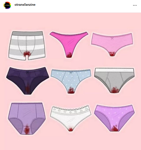
Image 2 (Source: Visibles.GT)
“9 pieces of underwear that belong to menstruating people. Organised in a 3 by 3 grid. The underwear is stained, maybe their owner forgot to empty their menstrual cup or an abundant menstrual flow overloaded their cloth pad or maybe they just decided to use their plain underwear. The same dark red blood appears in all the underwear, which is strange because blood tends to vary in reddish tones. Maybe this dark tone is because it is the first day of the menstrual cycle or maybe it has been stained for some hours. There are many pieces of underwear with blood, they probably have an odor but not necessarily a bad one”.

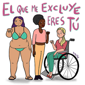
Image 3 (Source: Take Back the Tech! campaign in Latin America)
"Full shot of three women pointing forward with their finger. Above their heads is written: “You exclude me”. These three women are very different from each other, one of them is wearing a bikini and has wide hips, a pronounced abdomen and purple hair; the women in the middle is slim, black, curly haired; and the other is in a wheelchair, she is blonde with long hair. The three of them have a serious expression. The image is a pastel colour drawing”.

The “Talking Heads” workshop is inspired by the “Alt-Text as Poetry” workbook created by disabled artists Bojana Coklyat and Shannon Finnegan where poetic impulses emerge to create image descriptions for an internet that includes more people. And when it comes to describing, it’s not just about brief remarks but also improving accessibility, perception, feelings and senses for low vision and blind people that use automated screen reading programs to navigate the internet.
Coklyat and Finnegan invite us to play with language while following a certain character length and the need to inform.
An example could be the description that accompanies an image of an average garden.
We could have two options for an Alt-text regarding the same space:
- A garden with a tree in the centre and surrounding plants.
- A green space with different types of vines and plants. There’s an ancient walnut tree and a fence with hanging branches and winding passion fruit leaves.
For this reason, we interviewed 3 blind and/or people with low vision that would become our counsellors and guides during the workshops. We were interested in learning about the problems they face on a daily basis in an internet that, until now, is not designed to include all types of people despite the fact that internet is increasingly imposed as a mandatory bridge to access basic rights for the entire population.
From our conversations and what we shared together, we reached some criteria to work on a diverse visual documentation of the participants, as well as images that we selected online from feminist media and from feminist and trans-feminist organisations.
Ten people from different parts of Latin America participated in this activity wanting to support and encourage online and offline spaces through art, graphic design, grassroots communication and community technology for more inclusion and accessibility.
It was our first time gathering online remotely, without cameras or PowerPoint presentations, just the images we used to experiment. To start off exploring, we agreed on a framework of certain relevant points with our guides (two people self-perceived as women and a LGTB guy) based on our concerns and needs.
- More than the person’s physical appearance, it is more meaningful to describe what they are doing, their gestures.
- It is interesting to comment aspects that define attitudes, for example: the person is smiling, they are sad or reluctant.
- Objectivity/subjectivity: describing an image is inherently a subjective process - you apply your own ways of seeing and understanding when you write. However, a description should aim to provide a clear understanding of the image for a targeted audience.
(Source: “Alt Text as Poetry” workbook)
A selection of our findings
The two “Talking Heads” sessions emphasized the idea that it’s extremely important that those who experience disability are present and engaged in addressing accessibility. One of the most important ideas we got to as a group was to realise that people living with vision disabilities prefer a “scarce” description to nothing at all.Another thing we found out is the valuable piece of advice of including elements of other sensorial channels apart from the visual aspect when describing images. For example: describing someone “laying down on a bed of dry and crunchy leaves” is more efficient for a visually disabled audience than “on a bed of yellow and orange leaves”. Or describing: “a cloud that smells of pollution covers the sky” instead of “a grey cloud covers the sky”.
One of our guides pointed out that “smells, attitudes, colours can enhance descriptions”. An activity that we couldn’t do in the end because of time was to listen to how descriptions work through screen readers. We wanted to check out how those robotic European accent voices sounded like, not a comfortable way of helping us navigate the internet in our everyday lives.
Here are some main ideas that help us describe images more precisely:
- Specify the type of image: comic, illustration, drawing.
- Specify if there are men or women and other gender/racial identity aspects relevant to the image, though many times we can make mistakes out of unawareness of people and their self-perceived image.
- More than describing people’s physical appearance, it’s more meaningful to describe what they are doing, their gestures. It’s interesting to talk about attitudes and behaviours, for example: if a person is smiling or is sad or has a grudge.
- It’s also important to describe the text that appears in the image: speech bubbles, titles, source references, etc.
- The more we know about the context, the more we will know about the details in the image and the better we will be able to describe it.
- Keep in mind that personal judgements tend to be unnecessary.
- Our guides confirmed that, most of the time, screen readers are able to show author’s names but, if there isn’t an alternative text that indicates so, screen readers can’t obtain this information that isn’t generally related to the text/article.
Descriptions are also political
Finally, we believe that developing this type of experience in a playful and creative way is important because there are so many questions about how to describe “correctly” and playing frees us from judgement and helps us become “friends” with the “mistakes” and “errors” we make when trying to be fair with a particular image description. That’s why, instead of following a recipe, we share with you here some bits and pieces that our guide committee consider a priority according to their needs.Regarding the importance of image descriptions, one of our guide says: “I’m new to all this technology. I would get lost among the entertainment and information. Descriptions help my mind travel and visualise in my brain”. For another guide, this type of activity was meaningful because “it was an opportunity to have the same access to information as visually abled people. If the image is there, it’s important, right? I think the best person to describe an image is the one that chooses it and puts it in the right place. If it complements the text, we need to have access to it”. Finally, the third guide highlighted that “we need the message that the image conveys, keeping in mind that what we decide to think about the image is our personal choice.”
The activity gave us the satisfaction of becoming active explorers determined to make spaces more accessible: the internet, the streets, our meetings. The possibility of doing all of it through play made us reconcile with our concerns and hesitations: how do we address key identity issues (their self-perception in terms of gender, age, if they are racialized) when we refer to people in an image (people we do not know personally).
The workshop invited us to engage in talking and writing exercises focused on different sensorial perceptions (hearing, taste, smell, textures). Also, to “situate descriptions”, which is to say: to trace the context and political situation of those who address certain aspects and leave out others when creatively synthesising visual information. We are reminded once more, as journalism teaches us, that in every story or image something is left out and selecting implies making political decisions.
***
Here are some examples of images that we worked on, attempts of alternative texts by workshop participants, descriptions that can be improved or adjusted as we continue working on these initiatives. These texts were originally written in Spanish.
Image 1 (Source: Píkara Magazine)
““A comic of a couple in a pink bed. A dark skinned woman, a white skinned man. She acknowledges the romantic night together, he tells her to clean up the rose petals that he’s scattered around the house and prepare breakfast”.”.

Image 2 (Source: Visibles.GT)
“9 pieces of underwear that belong to menstruating people. Organised in a 3 by 3 grid. The underwear is stained, maybe their owner forgot to empty their menstrual cup or an abundant menstrual flow overloaded their cloth pad or maybe they just decided to use their plain underwear. The same dark red blood appears in all the underwear, which is strange because blood tends to vary in reddish tones. Maybe this dark tone is because it is the first day of the menstrual cycle or maybe it has been stained for some hours. There are many pieces of underwear with blood, they probably have an odor but not necessarily a bad one”.

Image 3 (Source: Take Back the Tech! campaign in Latin America)
"Full shot of three women pointing forward with their finger. Above their heads is written: “You exclude me”. These three women are very different from each other, one of them is wearing a bikini and has wide hips, a pronounced abdomen and purple hair; the women in the middle is slim, black, curly haired; and the other is in a wheelchair, she is blonde with long hair. The three of them have a serious expression. The image is a pastel colour drawing”.

- Log in to post comments
